Web design has changed a lot over the past decade, and so has our web app, MindMeister, which was launched in February 2007 as one of the first software-as-a-service tools. Now, 10 years later, MindMeister has more than 6 million users worldwide and is still growing rapidly. We’ve learned a lot about design and usability since we started this incredible journey, and we thought MindMeister’s 10-year anniversary would be a good opportunity to share some of these lessons with you.
2006
2006 was the year we created MindMeister’s first prototypes, and as you can see, they were still rather simple:
MindMeister prototype 1
At that time, Firefox was the best browser for web design, but the most common one by far was Internet Explorer, which was a real pain to work with. Seriously, everything below Internet Explorer 5 was just horrible. The existing browser technology wasn’t even ready for canvas drawing, which is why we had to draw the lines of our mind maps with 1×1 px DIVs. If you think that sounds like an incredible amount of work, that’s because it was.
2007
In February 2007, MindMeister was released as a private beta. Within two weeks, we had 1,000 users on the platform, and 10 times that many by May that year.

MindMeister homepage in closed beta stage
This simple page was the very first impression our users got of MindMeister. Back then, gradients were all the rage — especially super glossy ones! — and for ‘best’ effect they were usually combined with dark UI elements.
As we were in a closed beta stage and people could only access MindMeister through an invitation code, we didn’t even have a sign-up button.
To show people exactly what MindMeister was, we embedded a live (!) version of a mind map into the homepage, which enabled visitors to interact with the map, zoom in, open and close branches, and more.
For the official launch in May 2007, we had to adapt the homepage quite a bit:

MindMeister homepage during the launch in May 2007
You’ll notice a few things here:
- The site was glossier than vloggers doing the 100 layers of lip gloss challenge.
- We added a big H1 to help visitors understand at a glance what we were offering (and for SEO as well, of course).
- We included a big, round, glossy pink sign-in button. If this didn’t entice people to click, nothing would.
- Instead of a single sign-up button which would subsequently lead the visitor to the different subscription plans, the plans were all featured on the homepage itself.

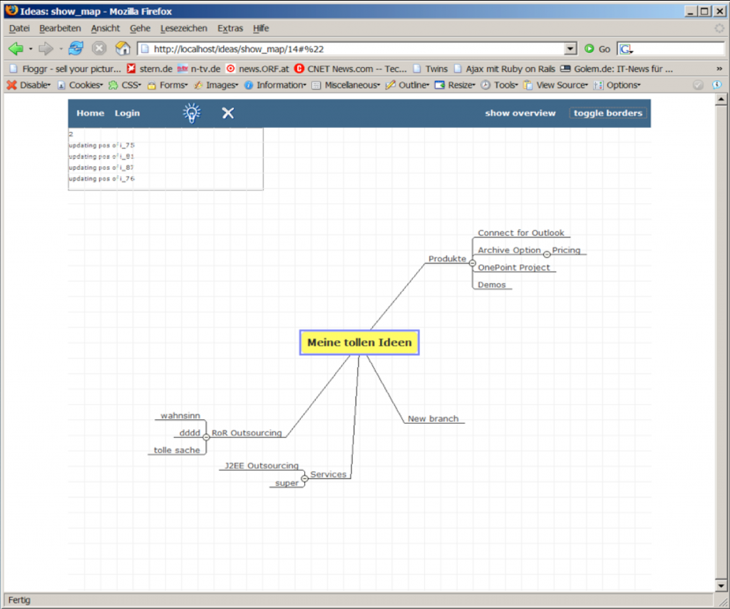
MindMeister’s map editor in 2007
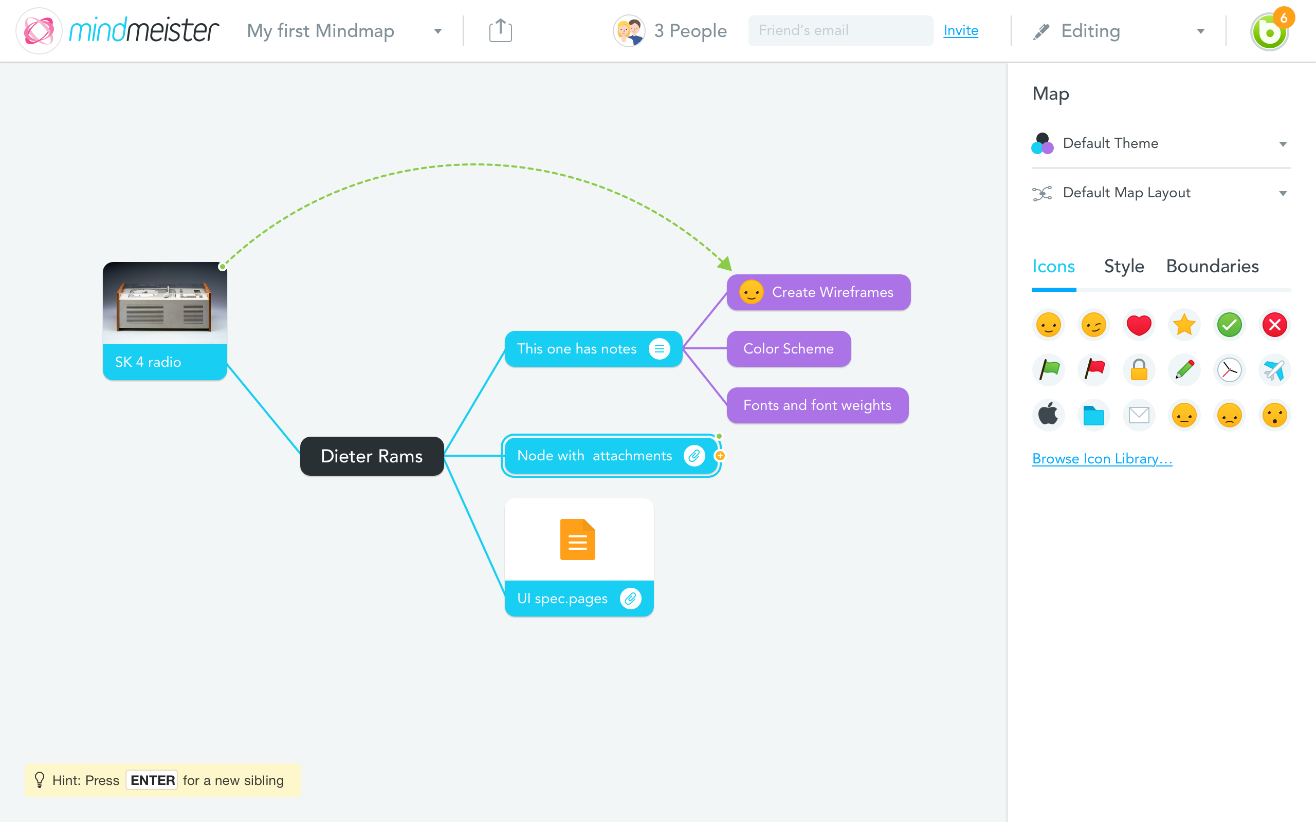
Our first proper map editor already had the three main UI elements that we still use today: a header, a footer and a sidebar on the right. Elements in the header were the ones that impacted the whole map, whereas everything in the sidebar affected only the currently selected topic. The footer included things like status notifications, sharing options and the like.
Already, we had added so many features that the sidebar on the right was getting too cluttered. To combat this problem, we made the sections of the sidebar collapsible, similar to how Photoshop and other Adobe products still do it. To ensure new users wouldn’t be too overwhelmed, only the most important sections were expanded when the user first entered the map editor.
The Share Dialog
Our number one USP has always been MindMeister’s collaboration engine, which allowed people to work together on a mind map in real-time. The map share dialog was thus one of the most important areas in the map editor, and we spent quite a lot of time trying to optimize it. Here’s an overview of the different versions we went through:

Version 1: Even back then we already differentiated between collaborator access and read-only access, so the first version of the share dialog featured two fields that simply showed current collaborators and current viewers of the map, followed by an email invite button below.

Version 2: In the second version, the standard Safari button we had previously used for the invite CTA was replaced with a shiny customized button. We also added an additional setting which gave the map creator more control over who got to add more collaborators to their map. Still, this dialog was extremely simple and straightforward.

Version 3: After studying how we ourselves used MindMeister, we soon realized that a) most people would probably collaborate with the same set of people on an ongoing basis, and that b) having to type the same email addresses over and over would become tedious quickly.
So for the third version of the dialog, we took a completely different approach. MindMeister automatically remembers email addresses the user has previously invited, so with the new UI the user could now quickly add viewers or collaborators to their maps via a simple drag and drop motion. This was the final version we ended up implementing in the live app.
2009

MindMeister homepage from 2009: The height of the glossy era
2009 was the height of the glossy-gradient boom, and as you can see, we went all out by adding a bold white rim around our H1. This is also when we first introduced the bright rays to the background, which not only represented the branches of a mind map but also symbolized the light rays of a new idea being born. They would stick with us for a long time.
If you look at websites from that era, you’ll also notice an increase in drop shadows everywhere. This is because browsers (all except Internet Explorer, as usual) were finally starting to offer good support for drop shadows, and designers jumped on them to improve the 3-dimensional effect of elements. Until then, shadows actually had to be added to the images manually, using Photoshop (we can see some of the younger designers among you laughing and shaking their heads at this).
MindMeister homepage from 2009: This time with Helvetica
Before the year was over, we realized that Variable Bold, the font we were using for our logo as well as headlines, just wasn’t going to do. With its playfulness, it wasn’t the kind of font that would speak to business users, our main target audience. So with a heavy heart, we said goodbye to the soft round curves of good old Variable and switched to Helvetica, which was clean and thin and worked perfectly on most systems. Finally, we were able to use real text for the headlines instead of images, which was great news for our localization efforts, too.
2012

MindMeister’s map editor in 2012
In 2012 MindMeister came out of the dark ages when finally both the website and map editor got visibly lighter and friendlier. We replaced the intense pink we had been using as our highlight color with a lively blue, which also gave MindMeister a much more professional appearance. Inside the editor the sidebar color was changed to a light gray in addition to being simplified and downsized quite a bit. This is the first time we introduced tabs for advanced features in the sidebar.
2014

MindMeister’s map editor with a fresh flat UI
In January 2014 we released MindMeister 9, which featured a completely revamped interface, using the flat design that had already transformed half the internet. Made popular by Apple’s iOS 7 with its lively colors, this mobile-inspired trend removed all shadows, gradients and depth from our website, bringing the focus onto the shapes of individual UI elements. Paired with a lot of white space, the new interface boosted a much cleaner, fresher, and most importantly simpler look that fit well with our overall focus on simplicity and usability.
A new CI for MindMeister
With Retina displays becoming ever more common, thin icons also became popular as the high-resolution displays could finally do those thin, sharp lines justice. And so, for the first time since its launch 7 years earlier, MindMeister also got a new logo and icon that fit the rest of the flat makeover.
![]()
2016

MindMeister’s map editor in 2016
In 2016 we released another subtle makeover for the map editor which was brought on by a number of usability tests and observations of how our users behaved in the editor. Various features were moved; map themes and alignments, for instance, were added to the info menu (i) in the top bar to simplify the footer.
Another influence during this update was MeisterTask, the task management tool we released in 2015. With a large number of shared users, creating a uniform experience on both tools became a priority. You’ll notice that the user avatar is now visible in the upper right corner of the editor, just like it is in MeisterTask, and that the online help button was removed from the bottom bar. The online help is now available through the account popover in both tools.
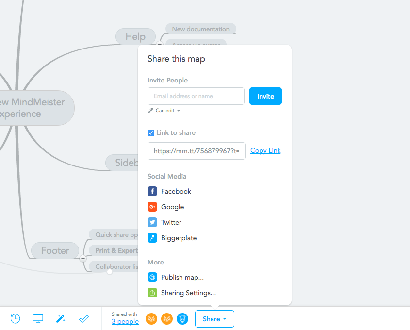
The new quick share popover
As teams rely ever more heavily on communication platforms such as Slack and HipChat, the importance of email invitation has reduced. To adapt to this change we introduced a quick share popover that put our link share option on the same level as the previously much more prominent invitation via email. You’ll also notice the addition of big social share buttons in the popover, which are enticing more users to publish and share their maps on Facebook, Twitter and other channels.
2017
Decluttered design idea for MindMeister’s map editor
Today, we’re again noticing that too many UI elements have accumulated in our map editor over the years. With a dedicated team adding and improving features constantly, that’s no surprise. But now it’s time we bring the focus back onto the mind map and its content, and we’ll do that by taking a good long look at all the clutter and cold-heartedly removing everything that isn’t essential.

Minimalistic design idea for MindMeister’s map editor
Another big focus of 2017 will be the consistency between the web version and MindMeister’s mobile apps, which haven’t gotten quite as much love over the past few years as they deserve. However, we won’t stop there. As we’re adopting a real mobile-first approach for the first time ever, we’re being forced to work with an incredibly small UI real estate and thus have to focus on what’s absolutely essential. And this, without a doubt, will have a positive impact on MindMeister’s web version, too.
Web design has come a long way over the past decade, and so has MindMeister. We’re excited to see the new trends the next 10 years will bring, and how they will affect the way we interact with web applications and websites in general.
What do you think the major web design trends of the next decade will be? Let us know in the comments below!
Simple and Intuitive Mind Mapping
Try MindMeister Now