At MeisterLabs, we did our first usability test last year on our mind mapping product, MindMeister.
As a team that focuses on designing attractive and easy-to-use software, the test was an eye-opening experience. It forced us to think long and hard about our software design philosophy and presented four tough questions that SaaS designers have to answer, one way or another:
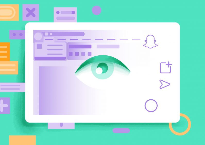
1. Where Do You Land on the Snapchat-Word Continuum?
Part of the usability test involved eye-tracking software that allowed us to see what parts of the interface people were looking at.
Despite all the innovations in software design and UX that we’ve seen over the last years, it quickly became apparent that when people get stuck in software, they invariably look up. As in: they are checking the place where Microsoft Word or Outlook typically have a big multi-tab collection of text elements, icons and random drop down menus, also known as The Ribbon.
This, of course, means every software designer needs to make a choice about where they want to position themselves, choosing to be either:
- on the Snapchat end of the continuum, where users are supposed to figure things out and need to remember the secret combos that unlock certain pages and functionalities
- or, on the Microsoft end of things, where elements are expectedly found at the top of the interface.
Affordances and signifiers
In the more scientific terms of Don Norman’s classic ‘The Design of Everyday Things‘, this is the battle between affordances (the implicit qualities of a product that allow it to be used) and the signifiers (the interface elements that inform the user explicitly where they can push, pull, click or dial).
The door at the end of the corridor with a metal panel to push has affordances. If the panel has ‘Push here’ imprinted on it, this would be its signifier.
Industrial designers have decades of experience in frustrating users by hiding signifiers because they find minimalism more beautiful. The result is that you can’t find the light switch (hidden in the wallpaper), can’t open the kitchen cabinet (you have to push the edge, not pull), or you can’t get water from the tap (you have to wave at the tap in exactly the right spot).
Flat software design and intuition
In software design, we’re evolving in the same direction. Quora user Ivan Braun recently made a good case about the arrival of flat design, and how it ruined the accessibility of the web. Yes, flat design makes software prettier, but it also leaves less room for signifiers, like the glass edge that showed you which buttons were clickable in iOS.
The consequence is that today, you have to just know which buttons in iOS are clickable and which ones aren’t:

While I agree that flat design can make software a bit more challenging to use, I’m convinced that software design needs to err on the side of innovation and minimalism.
This means our industry is better off following the lead of bold companies like Snapchat or Apple. Ditching the iPhone headphone jack, for example, will be uncomfortable for a while. But it will be replaced by something simpler and leaner, forcing other companies to follow suit.

2. How Does Your Interface Grow with the User?
Then there’s the opposite problem: how do you avoid a software design that is too simple for advanced users?
It’s quite clear that your software needs to be easy to understand for beginners. In the app industry, we know that 84% of users won’t return to an app for a third try if the first two experiences were glitchy or unsuccessful. In order to retain users, you have to nail that first experience.
But new users will quickly become more sophisticated and want to do more. We’ve found that our MindMeister users soon want to embellish their mind maps, by:
- adding images
- presenting their content to others
- sharing their content online
- creating links between their content.
Maybe they like your software so much that they’ll find use cases that push your interface to its very limits. This is a good problem to have, no doubt, but still a challenge we need to solve. It also presents probably the hardest question for a software designer:
How can I design software that meets the user with functionality at exactly the right moment in their customer journey?
This remains one of the biggest challenges for me personally: when you’re working on an app for more than a decade, the temptation can arise to complicate things – and potentially overcomplicate them.
‘Advanced Mode’ isn’t the answer
One thing I do know is that software with different modes or states, like the “Advanced” or “Editing Mode” that you find in some apps, are not the answer.
In my previous job, I had to help users with software systems. My first question was always: “Please tell me what mode your system is in?” People never knew the answer to that – they always needed to search for the answer at length, guided by more probing questions from me.
We launched MindMeister in 2006 and haven’t stopped perfecting our interface ever since. We’ve tried it all – the bare bones look at the beginning to the hyper-gloss phase a few years back.

Of course, now, we want to make the tool as streamlined as possible, for both our web and mobile apps, and we’re going back to basics by focusing on our users’ content.
3. What is the Reward?
This is one question that you need to be able to answer clearly – whether you launched your product yesterday or you’ve been on the market for ten years.
In his bestselling book Hooked, entrepreneur and design expert Nir Eyal tries to explain how some companies create products that you just can’t put down. The golden standard are of course products like Facebook, which studies have proven our brain wants to check every 31 seconds.
What is it that makes you fall in love with these products? One of the main attractions of truly “habit-forming” products, Eyal concludes, is that they reward the actions they trigger.
Rewards can be anything. The only thing really required is that your user experiences a small, almost imperceptible boost of satisfaction. Imagine the feeling you get when you finish assembling a piece of IKEA furniture.

For example, Eyal points out that LinkedIn provides users with reward when they input more details about themselves into the professional networking platform. A graphic pops up that illustrates how close to complete your profile is, building incentive in users to finish what they’ve started.
When you’ve provided enough information, LinkedIn lets you know that your profile has reached “All-Star” status. Eyal says that the graphic increases the likelihood of users opening a premium account and thus launching into the investment phase.
Knowing your product’s reward will allow you to reduce the time your user needs to get that very first boost – and reducing your ‘time to wow’ will increase the likelihood of bringing the user back a second time.
4. Are You Future Proof?
Finally, there’s the question: How will we survive the onslaught of new technologies that launch every day?
Augmented reality, virtual reality, artificial intelligence (the list goes on …) will change how users interact with content: they’ll be able to verbally access information (no more UI required!) and experience it in 3D (UI everywhere around you!).
One main difference will be that the workspace will include the entire field of vision rather than a 24-inch slice of it. But that will probably be compensated partly by the fact that hand gestures aren’t as granular as the pointer of a mouse.

And at the same time, the fundamentals will remain. We follow the 98 percent rule – in any productivity tool, about 98 percent of the UI should be reserved for the user’s content. This principle is at the core of MindMeister – and will be even more so in our upcoming redesign – as well as the design of our second product, MeisterTask.
In both cases, stuffing the entire field of vision with possible action buttons will be just as confusing as offering a nine-tab ribbon with 25 clickable items per tab. The more things change, the more they stay the same.
Discover intuitive task management
Sign-Up & Save 30%